client
three rivers precision
Logo and brand design for a contract manufacturing and engineering partner based in Pittsburgh, PA.
Logo Design
Typography & Color System
Brand Guidelines
project overview
As a new business, they needed branding that communicated their 10 years of experience in the industry along with their streamlined, accessible take on the manufacturing process.
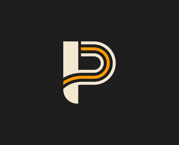
We landed on a bold, heavy logotype with subtly rounded edges to convey strength with approachability. As nod to the three converging rivers in the heart of Pittsburgh, where many of their clients operate, the brandmark contains three distinct, flowing lines building the P. The green and gold color palette offers a sense of familiarity while separating Three Rivers Precision from its competitors, who generally gravitate towards reds and blues and operate in more traditional ways.
objectives
- Design a logo and key brand elements to accurately reflect the positioning and personality of the business
- Set Three Rivers Precision apart from other local manufacturing services and establish authority as a new option in the industry
- Quickly establish a sense of familiarity, approachability, and a fresh take on manufacturing


