client
heyday web media
A brand refresh for a small but mighty digital marketing agency based in Atlanta, GA.
Brand Identity Refresh
Typography & Color System
Visual Guidelines
project overview
Heyday exists to help companies grow. As a Storybrand-certified digital marketing agency, Heyday works as a trusted guide for companies looking to achieve the growth they’ve worked so hard for. Offering clear messaging, proven strategies, and eye-catching design services, Heyday was looking to elevate their brand design to reflect their value and appeal to clients with larger budgets.
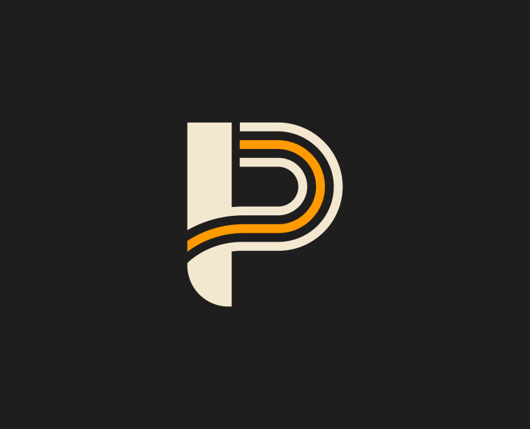
After trying on several new colors and font pairings, we landed on a warm, earthy palette complemented by a sharp serif and monospace font. This visual identity better reflects Heyday’s bold yet grounded personality.
objectives
- Refresh key elements of the brand, including the logo, color palette, and typography, to accurately reflect the positioning and personality of the firm
- Elevate the look and feel of the brand to appeal to larger businesses with the budget and appreciation for dedicated marketing support
- Boost current clients’ trust and confidence in the brand

“I have worked with Danielle for almost two years. She worked for my agency full time until I decided to scale down to a solo consultancy. Danielle is awesome in every way. Her designs are top notch and she is incredibly easy to work with. She listens well to clients’ ideas and offers her own ideas to make the final design the best it can be. She is a focused, hard worker who always gives 1000%. Highly, highly recommend Danielle!”

Chris Shull
Founding Principal, Heyday Web Media


